

Something perplexing about UMAP
If you want to visualize some large high-dimensional dataset, odds are you’re going to try UMAP. After its initial release in 2018, it quickly displaced t-SNE (which had itself displaced, I don’t know, diffusion maps?) as the nonlinear dimensionality reduction method everyone uses by default, particularly in machine learning (for instance, dealing with embeddings or neural network activations) and biology (e.g. for looking at single-cell gene expression profiles).1
There are a handful of parameters that UMAP users tend to adjust when creating
embeddings, with n_neighbors probably being the most common. The UMAP
documentation
highlights the need to explore different values of this parameter in order to
get good results. If n_neighbors is too low, it’s possible for the resulting
embedding to look like a whole bunch of tiny clusters with no relationship to
each other. If it’s too high, computing the embedding can take a really long
time, and some of the local structure in the dataset can be lost.
UMAP builds its embedding by building a nearest-neighbors graph on the points,
assigning weights to each edge in that graph based on a normalized version of
the distances between points, and then optimizes the embeddings in the target
space so that their weighted nearest-neighbors graph is as similar as possible
to that of the original data. (UMAP’s creator sometimes calls the graph a “fuzzy
simplicial set,” but there’s not really much lost by just thinking of it as a
weighted graph.) It makes sense, then, that the n_neighbors parameter has a
pretty big influence on the resulting embedding. If there are two high-density
regions of the data separated by a lower-density (or completely empty) region
and n_neighbors is low, it’s quite possible that all the nearest neighbors of
every point in each region lie inside the same region, meaning that the
neighborhood graph becomes disconnected, and the embedding algorithm has no idea
where to place the clusters in relation to each other. Increasing n_neighbors
makes this less likely to happen.
A puzzle
So far so good. But let’s look a little closer using some synthetic data. We’ll
arrange a bunch of clusters along a line, and vary the number of points in each
cluster. As long as the number of points in each cluster is less than
n_neighbors, there should be at least some information about the relationship
between clusters in the neighborhood graph, and we should therefore see it in
the embedding. But here’s what happens:
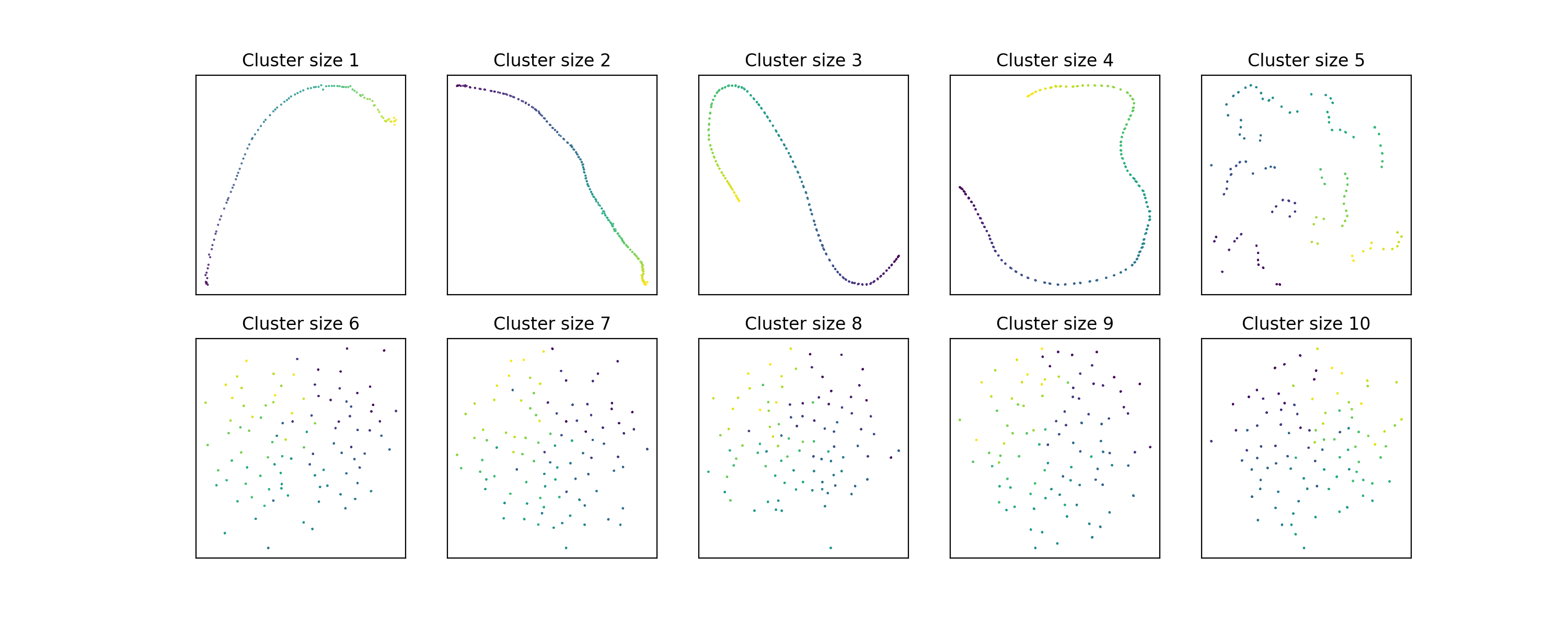 The information about the position of the clusters on the line starts to
disappear around cluster size 5!
The information about the position of the clusters on the line starts to
disappear around cluster size 5!
These embeddings used the default value of 15 for n_neighbors. What happens if
we increase it to 30?
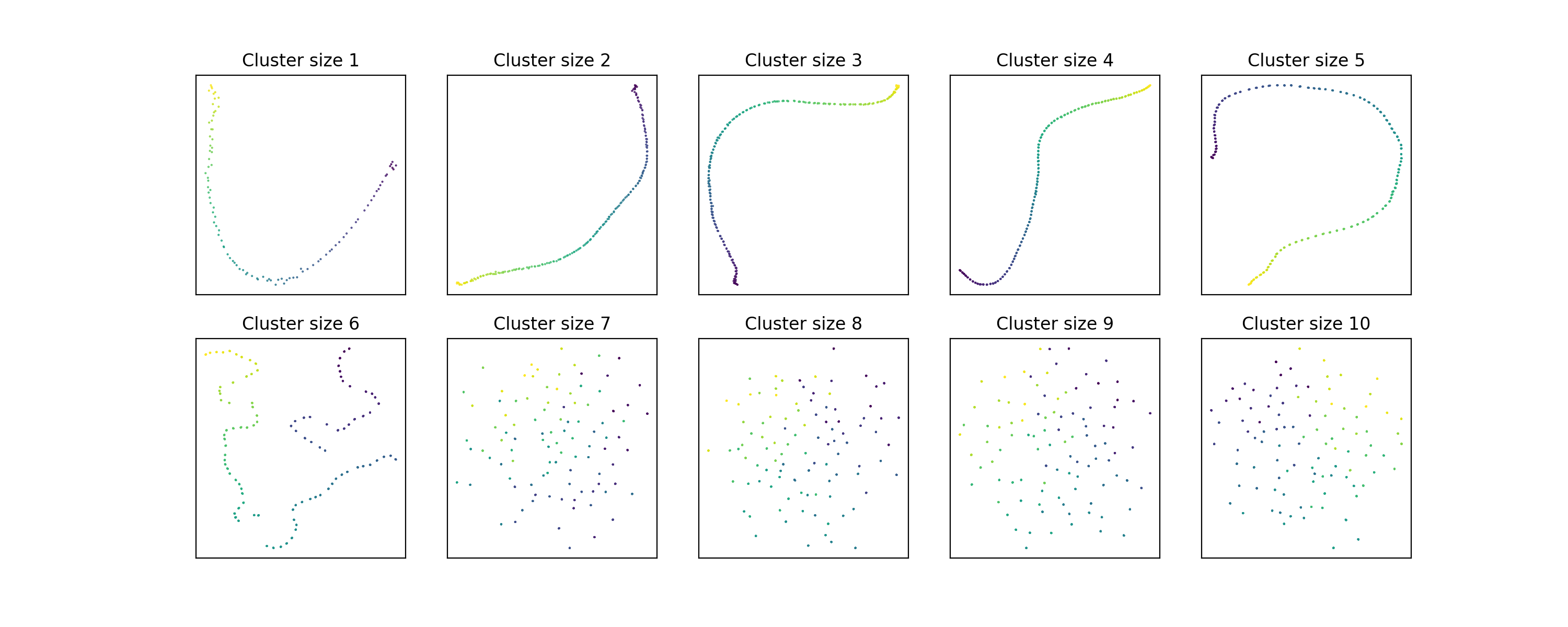 Hmm, looks like the larger-scale information sticks around a little longer, but
still breaks down by cluster size 7. Maybe if we double
Hmm, looks like the larger-scale information sticks around a little longer, but
still breaks down by cluster size 7. Maybe if we double n_neighbors again?
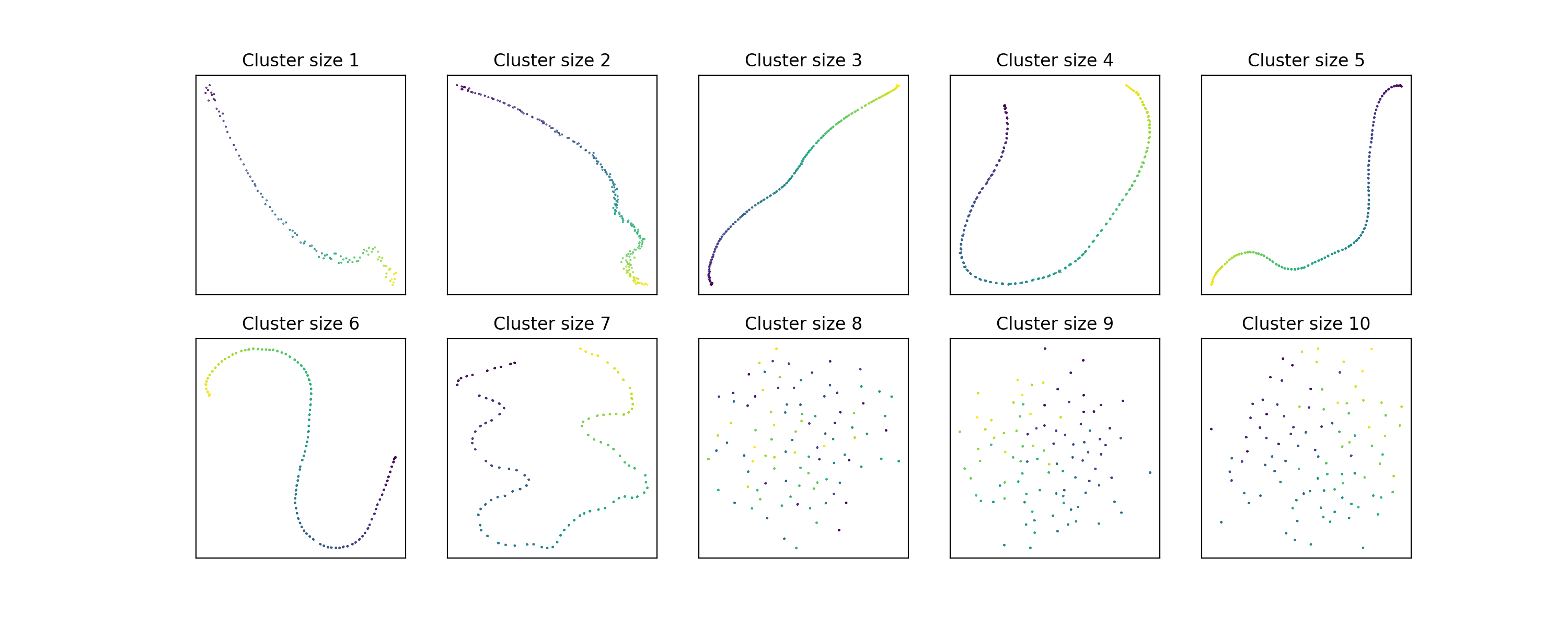 It seems that doubling
 n_neighbors only increases the number of data points we
can handle per cluster by 1.
What’s going on here?
It turns out that this is a consequence of the way that UMAP normalizes distances in the graph. UMAP wants to assign a weight to each edge in the graph. However, since the raw distances in a point cloud could be very different between points, it’s important to do some density correction. First, we’ll always assign the edge from to its nearest neighbor weight 1. This means subtracting the distance to the nearest neighbor (we’ll call this ) from all distances, or equivalently dividing all weights by the largest weight. Then we’ll ensure that the total weight of every neighborhood is the same. This is done by finding a scaling factor so that
for some target neighborhood weight (constant across neighborhoods). Equivalently, we find some exponent so that . The UMAP paper (without any explanation, or even a mention that this is a choice) sets , where is the number of neighbors found in the graph. (To be precise, it tries to get the value of the sum excluding the nearest neighbor of to equal , which is equivalent.) 2
Let’s look at what happens when has a more than one neighbor at distance . The first normalization step sets all these distances to zero, which makes perfect sense. But notice that now the corresponding terms in are all equal to 1, and the next scaling step can’t modify them. In particular, what if there are more than neighbors at the same distance?
The UMAP implementation finds the appropriate value of by a simple bisecting search, which works because the objective function is increasing in . But when the equation has no solution, this search is terminated after 64 (!) steps, giving a value of . There’s actually a check for this situation, and if the value of is too small, it’s replaced by times the average distance in the graph. This means that the weights actually affected by end up looking like , which is basically . This is tiny, so much so that it underflows to 0 in 32-bit floating point (which the UMAP implementation uses). So if has at least neighbors at equal distances, all of the edges to its more distant neighbors end up getting a weight of zero! The normalization ends up effectively giving us a graph with neighbors instead of .
This argument depends on having a bunch of neighbors at exactly the same distance, but the phenomenon is pretty robust to small variations in distance for the nearby neighbors. The above examples actually have clusters sampled from uniform distributions of width 0.05, while the distance between cluster centroids is 1. Increasing the spatial dispersion of the clusters makes the default UMAP settings perform somewhat better, as expected, since it makes the difference in distances between near and far neighbors smaller.
I hacked support for setting independently from n_neighbors into the
umap library. If we set to 10 and keep n_neighbors = 15, here’s what
the plots look like:
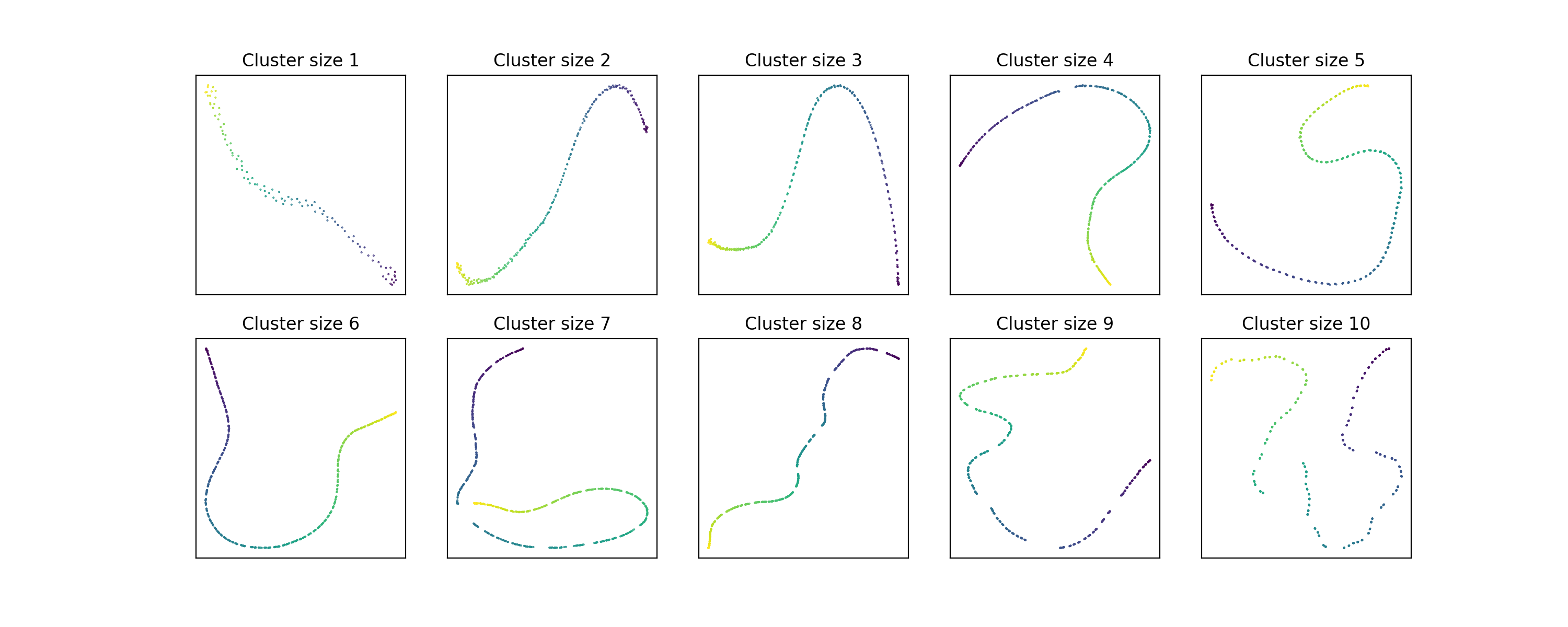 The problem is more or less fixed.
How much does this matter?
For the typical uses of UMAP, probably not that much. Most of the data that people analyze with UMAP is big enough and has varied enough distances that the kinds of sharp density transitions that cause this problem aren’t very common. At least, this is probably the case for data coming from some continuous metric space. But UMAP also supports a wide variety of more discrete metrics like the Hamming or Jaccard distances. With these metrics, tied distances are much more common. In fact, I first ran into this issue in the wild (without knowing it) while using the random forest proximity metric (basically, the distance between two data points is the number of trees in the forest where the points end up in different leaves). In these situations it’s possible to get quite large sets of points at distance zero from each other. Probably the right thing to do there is deduplicate the points before trying to do an embedding that relies on a fixed number of neighbors per point, but only effectively having neighbors when you thought you had certainly doesn’t help.
Another time when this might matter is when looking at small datasets. There’s
an issue from 2018 on the UMAP
GitHub repository complaining that the embeddings of points sampled from a
normal distribution don’t change much as n_neighbors increases. Tweaking the
neighborhood weight target does seem to alleviate that issue somewhat. Here’s
what embeddings look like with :
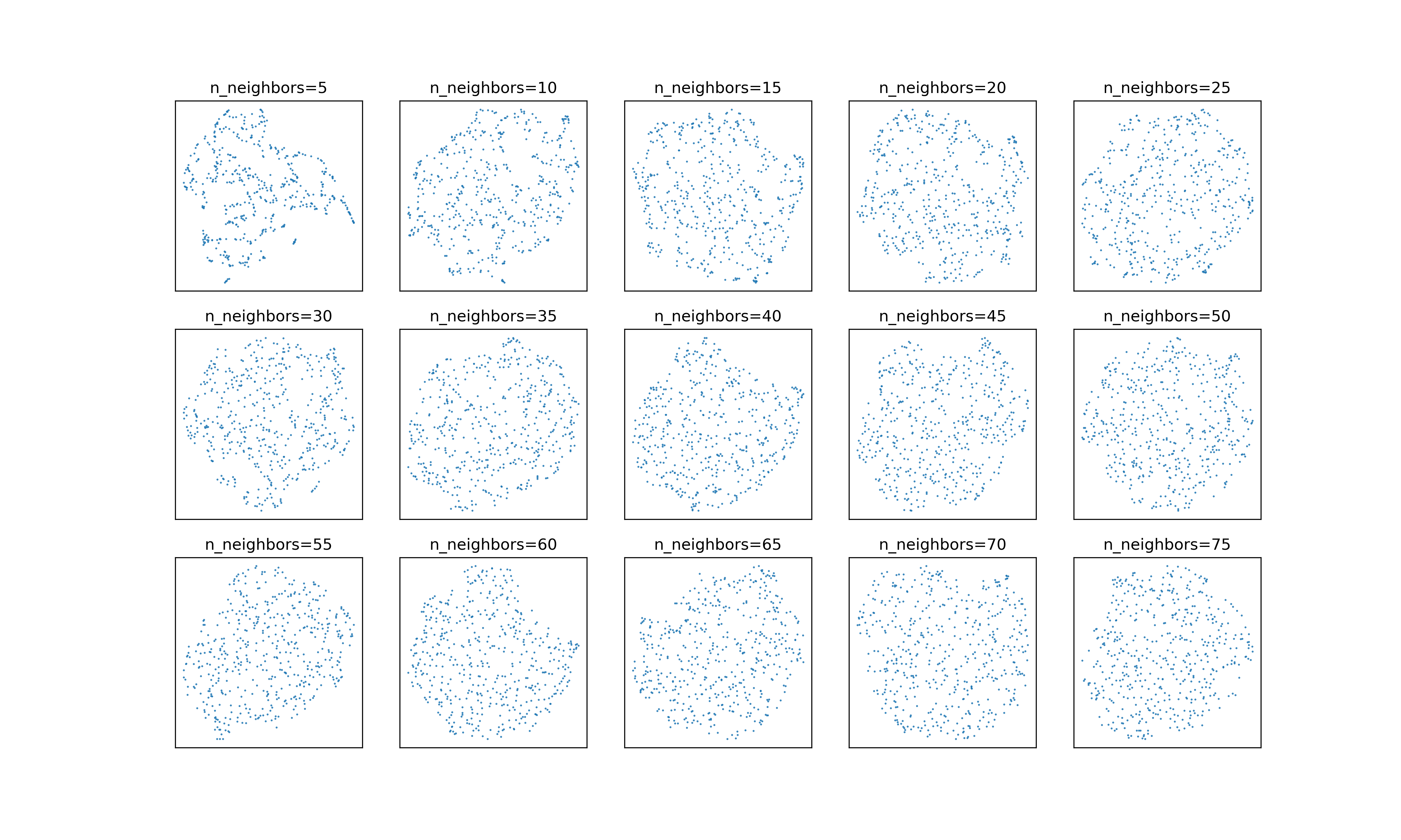 And here they are with :
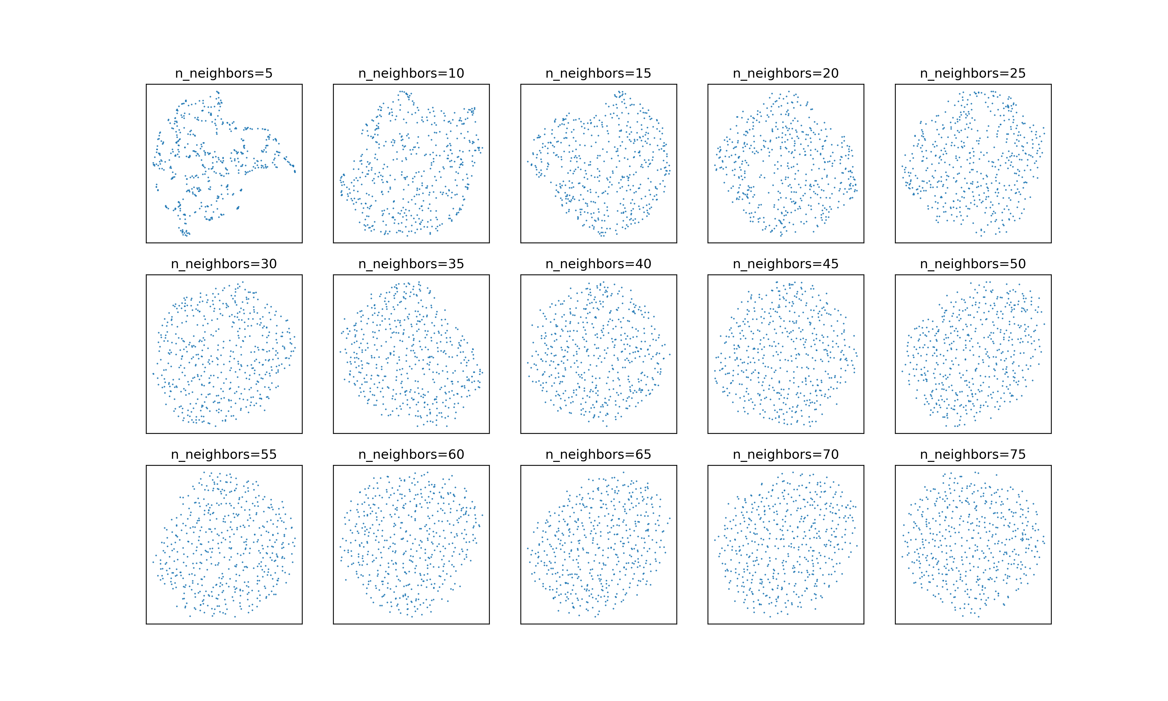 It’s subtle, but the embeddings with the adjusted neighborhood weights continue
to smooth out a bit as
It’s subtle, but the embeddings with the adjusted neighborhood weights continue
to smooth out a bit as n_neighbors increases.
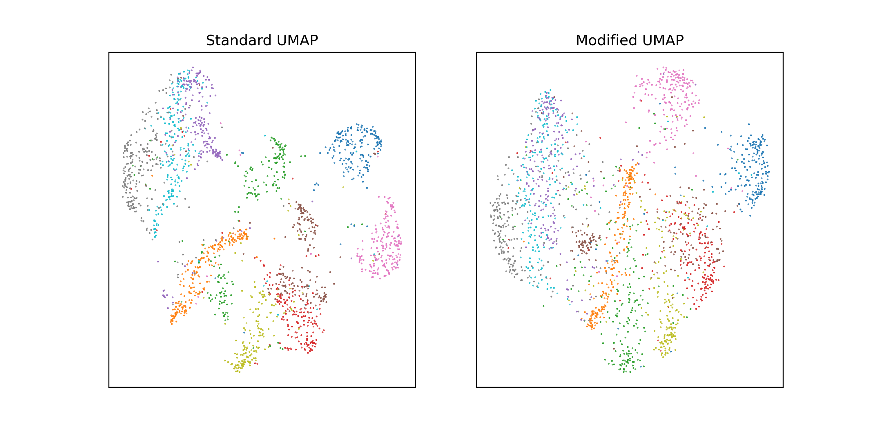
This type of behavior seems to be most prevalent in smaller datasets. To use the
excruciatingly standard example of embedding MNIST: if we subsample MNIST to
2000 images and run UMAP with n_neighbors = 60, there’s a pretty significant
difference between the two neighborhood normalizations.
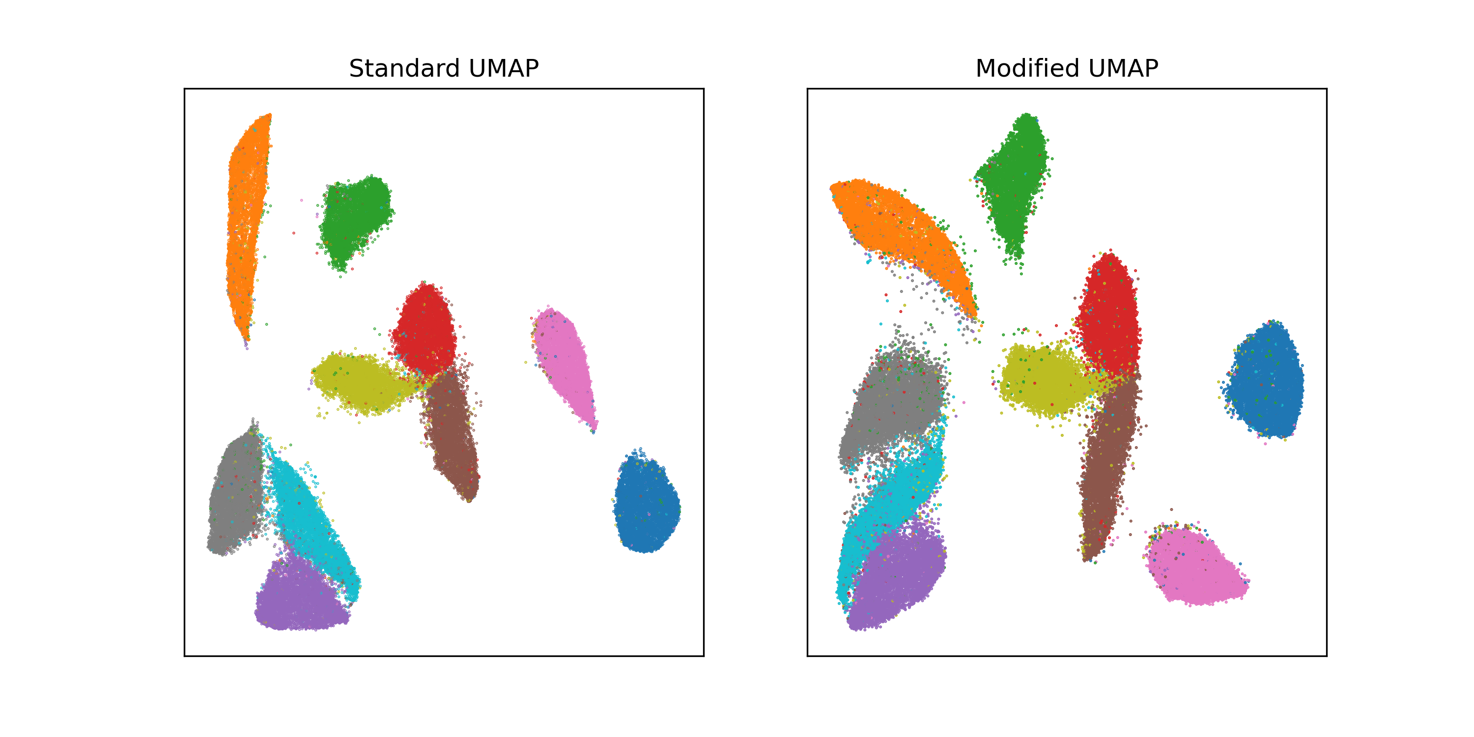
 On the full dataset, the difference is minimal; the version with maybe looks a little fuzzier.
 Again, in most cases this isn’t going to make a big difference. Still, this does
seem like a bit of an unforced error. I’m a fan of this
paper that investigated the factors that make
UMAP look different from t-SNE look different from Laplacian eigenmaps.
(Spoiler: it seems to come down to the relative strength of attractive forces
between neighbors and repulsive forces between all pairs of points.) One of the
ablations the authors did was replacing all the graph weights with 1, which had
minimal qualitative effects in the examples they looked at (including, yes,
MNIST). So all the complicated weight processing that caused this issue may not
be buying us much anyway.
Again, in most cases this isn’t going to make a big difference. Still, this does
seem like a bit of an unforced error. I’m a fan of this
paper that investigated the factors that make
UMAP look different from t-SNE look different from Laplacian eigenmaps.
(Spoiler: it seems to come down to the relative strength of attractive forces
between neighbors and repulsive forces between all pairs of points.) One of the
ablations the authors did was replacing all the graph weights with 1, which had
minimal qualitative effects in the examples they looked at (including, yes,
MNIST). So all the complicated weight processing that caused this issue may not
be buying us much anyway.
Really, the main thing to take away from this is that the results of any dimensionality reduction method are never a perfect representation of the relationships in the data. There is no perfect representation. Every method of data analysis, supervised or unsupervised, is a way of prying out some insight into a hidden underlying truth about the data. The better you understand the techniques you use, the better you’ll be able to grasp that hidden truth.
-
Why did UMAP win out so quickly? I think mostly two things (and really mainly the first): the standard UMAP implementation was at the time much faster than the standard t-SNE implementation, which really matters for something you’re primarily using as a visualization tool. (Nowadays optimized implementations of both algorithms are pretty similar in performance.) UMAP embeddings also tend to look more interesting and varied than t-SNE plots. The stereotypical t-SNE plot looks like a collection of blobs smushed together into a circle, while the stereotypical UMAP plot is full of teardrops and spirals and all kinds of dynamic-looking shapes. Another way to say this is that UMAP embeddings exhibit very high variations in density of points. This turns out to be useful if you’re using them as inputs to a density-based clustering algorithm like HDBSCAN. ↩
-
My hunch is that it comes from trying to do something sort of like t-SNE’s perplexity normalization of the weights for each neighborhood. There the weights are normalized to sum to 1 (i.e. be a probability distribution), and the corresponding bandwidth parameter is set so that the entropy of the distribution is equal to . The number of neighbors used in the computation is usually chosen to scale linearly with the perplexity , so if you squint, t-SNE’s normalization looks like . ↩